
I am from a bright and tall wall of captured moments.

From mercuryrapids at ufoevolution.com
Whenever people interact with other people that they have not met before, the situation tends to become a little stiff. This was one of the apprehensions I had when walking (well, running, actually) to class this past Wednesday. Needless to say, I was pleasantly surprised when I arrived and found the two groups of people yapping away like old friends.
Now, perhaps I saw a “glass half empty” scenario instead of looking at the bright side of things. After all, this was a symposium of two groups of passionate, intelligent college students who had been working with similar subjects all year, not some bunch of randoms stuffed in a library study room.
At any rate, I was still extremely happy to discover how loud and boisterous the atmosphere of the room actually became. Correct me if I am wrong, but I do not remember any other time in the semester in which Dr. Hessler needed to quiet down our class!
So, was this visit successful? As far as my experience goes, I would say it most certainly was.
Was it awkward at all? Nope.
Hope everybody enjoyed it!

Hello, all my friends! I am excited and interested to see what the rest of my Oklahoma class has come up with to give to our visitors. As for myself, I have created what I hope is an interesting spin on the Marauder’s Map from the Harry Potter book series.
It is a three page map, beginning, of course with what the map viewer must audibly say (well, he or she must at least look at the words, I guess) if they want a peek at the hidden contents on the next page. Since I very much liked the concept of creating a mock-Marauder’s Map, I decided to make my subject fit my mold, which is something I do not usually do (I usually work in the exact opposite fashion). I am very pleased with how my gift turned out. In fact, I am almost a little upset that I have to give it away, to be quite honest. It is amazing how things we sometimes collect or happen to make become meaningful to us…
Anyway, on the page of the actual map (which is of the Administration/Office portion of the Theatre department, located in the basement of the Bass Music Building), I decided to give every person (the teachers and administrators) their own dot in their designated office space, complete with their own fictional nickname. The nicknames describe some aspect of their job, character, or expertise, and I even managed to include an actual Harry Potter reference in one of the nicknames. The actual initials of their names can be found nestled right next to their dots and nicknames. In accordance with this trend, all the spaces located down in that area of the building are also given fictional names. To top off my allusion of epic proportions, I wanted to name the area I mapped something equally epic; I dubbed this space filled with the amazing professionals who run this department of our wonderful school The Hall of Aces. After all, they are the experts. And that name sounds sort of mystical, too!
This type of mapping required me to use ALOT of generalization. Since I wanted to give my map the appearance of an old, parchment, hand-drawn map, I utilized only neutral colors and basic lines/handwriting font to show the area I portrayed. Many details of the theatre school basement are missing, but this adds to the mystique. I mean, would it fit to have a space labeled COPY ROOM in the map I made? No, it would take away from the fantastic aura of The Hall of Aces. Also, there are plenty of white lies present; I am pretty sure nobody officially calls anyone any of these names… except maybe for that guy labeled “Shakespeare Guru” (hey, Lance Marsh knows his stuff most thoroughly, let me assure you!)
I added a personal message for whomever gets my map, and in fitting with Regulus Black’s note in the fake horcrux, I signed the letter (the third page) with my initials, J.M.P.
Even though I put a lot into this project, I am still surprised and a little disappointed in myself…because I really want to keep what I made! I invested so much of my college experience, along with my internalization of wonderful, wonderful books that have become a part of me, into this project, and I guess that is the reason for my nostalgia. But no matter; something we all must learn and remember is that what lives in our minds, lives in our hearts, and what lives in our hearts, lives on…wow I feel sort of ridiculous about getting emotional over my project! Excuse me, please!
Again, I am very interested to see how everyone’s art turned out.
As always,
J.M.P.
Oklahomans, fellow students, lend me your ears: we have three weeks left of school! All this tornadic activity (and I am actually talking about the swirling of my brain due to the oppressively exciting imminency of the summer break) is making me crazy and might have possibly caused me to develop a temporary case of ADD. I will push through, however, and I vow to conquer the unproductive tornadic tyranny that churns my mind!
One of the first final steps to take this year before vacation is the creation of our “Invisible City” Exploration map. I thought a lot about what I like about our city and university and how I could offer insight that would be both valuable and interesting to a visitor but would also show him or her a piece of the area that would be explorable given their limited amount of time here. So, I chose to give the AUM students a picture of the basement of the Theatre building, where the theatre faculty office rooms are located. The map would, of course, include all the rooms and the layout of the building itself, but it would also provide a short but detailed description (in the form of a label/title) about who is inhabiting each room. Sound familiar, Harry Potter fans? Good, cause it should. It will be a Marauder’s Map of the theatre school’s administrative wing!
Why use this format, you ask? First off, it allows me to put a personal spin on how my chosen area of OKC is portrayed. For instance, in the Harry Potter version of this map, the dots are labeled “Snape” or “Malfloy,” but, in my map, the name for someone’s dot will be something like “Shakespeare Guru — L.M.” In this way, I am not just showing our visitors a list of names that mean nothing to them; I am giving them a specific idea or subject with which to identify each name (or set of initials, really). Though this method of labeling my map may be a bit of a generalization (hint-hint: I believe that generalization is what I will be focusing on in my project!), I think it might be fun for the students to almost go hunt out the person with each particular expertise. For me, knowing what each teacher was specialized in made me want to meet and interact with him or her, and to also ask tough questions to which they would probably know the answer due to their experience; at the very least, I wanted to know what these interesting people were like. I would hope that this aspect of the map would prompt a student or two to go seek out one of these theatre professionals to talk to, or even just to meet, so he or she could ask a question that might have been burning him or her for awhile. Also, this setup gives the AUM guests a great impression of the artistic clout of our school; yes, culture does in fact exist in Oklahoma!
So far, my supply list/resource bank contain these items/ideas: an origami star that I made and plan to use in some way, a piece of parchment-ish paper, a lot of personal experience in the Theatre building, and a pencil. This list is bound to grow and (hopefully) flourish into a fleshed-out project within the next few days as I complete my idea…as long as I can avoid any further tornadoes of the mind, that is.

Contained in this posting is my Visual Analysis Paper. Read it, digest it, tell me about it. Please.
Have a great night, everybody!
https://pictureswespeak.files.wordpress.com/2012/04/visual-rhetoric-test-tasting-maps-jmp.docx
Hello everybody!
For my analysis project, I will be using the two maps that I examined in my last post, and I intend on using the three concepts of generalization, color, and juxtaposition in my paper. I have decided to branch much of my paper from my April 4 posting, “A Contextual Juxtaposition,” and will be studying how generalization and color play major roles in how people view a map/maps within their intended context.
Just like a seed grows a plant, so shall my blogs spawn a paper!!! Similes make smiles! 🙂
The two following maps, which are also the two maps I used for “A Contextual Juxtaposition,” will be the two maps I analyze for my project:

I look forward to finding interesting, extended metaphors to encompass my ideas and interpretations. This is one of the reasons I chose to branch from my April 4 posting; I really like the contextual imagery I discovered when writing that post, and I want to continue expanding on it.
Here is an example of the type of writing I will look to use in constructing portions of my analysis. This might even end up being an exact quote from my paper. Who really knows at this point? Anyway, here you go:
“Context: it’s pretty much everything.
Indulge me here: Just think of your favorite dessert or food. Nothing could ruin it ever…right? Well, would you still enjoy eating that food if you were sitting in a dumpster filled with garbage, sewage, and rotten fish? My guess is that your answer would be a big, fat, “NO!!!” It would not matter if you were chewing the most perfectly crafted cookie in the history of mankind; the dumpster would overwhelm the deliciousness of that cookie! Yes, my friends, context is everything; because the reality of anything is not in its essence, but in how it is perceived.
Monmonier applies this principle of the perceptual importance of context to how colors on a map are used. If a map uses colors in an unspecific or arbitrary way, the colors meanings are muddled, confusing, and frustrating, in the same way that a delicious cookie eaten amidst foul smelling trash has the power to infuriate the consumer.” — “A Contextual Juxtaposition”
I wish you all the best of luck with your papers! Have a great weekend/Easter!
I hope all your seeds grow and flourish, my friends.
Context: it’s pretty much everything.
Indulge me here: Just think of your favorite dessert or food. Nothing could ruin it ever…right? Well, would you still enjoy eating that food if you were sitting in a dumpster filled with garbage, sewage, and rotten fish? My guess is that your answer would be a big, fat, “NO!!!” It would not matter if you were chewing the most perfectly crafted cookie in the history of mankind; the dumpster would overwhelm the deliciousness of that cookie! Yes, my friends, context is everything; because the reality of anything is not in its essence, but in how it is perceived.
Monmonier applies this principle of the perceptual importance of context to how colors on a map are used. If a map uses colors in an unspecific or arbitrary way, the colors meanings are muddled, confusing, and frustrating, in the same way that a delicious cookie eaten amidst foul smelling trash has the power to infuriate the consumer.
Onward to the maps! Here is my previous one:
The colors on this map clearly describe the different temperature climates of the United States in October of 2011. Even without the scale on the right hand side of the image or the numbers riddled throughout the meat of the map, it is plain to people (because of basic human experience) that red means hot, blue means cold, and the colors in between mean just that: temperatures in between hot and cold. The viewer of this map encounters no impediments to barricade their visual “tasting;” this map certainly has no rotten fish in or around it.

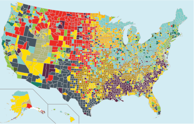
Now, please just take a wild guess at what this second map is describing: Is it climate types? Is it pollution? What does that vivid scarlet red mean?! So many colors to take in and process…ohhhh those poor people in those red areas, and the ones living in the yellow can’t be much better off! AHHH! The horror!!!
Ok. Now that you understand a gross over-dramatization of what went down in my head, let us get to the facts: This map, my friends, does not condemn those “poor” red and yellow counties to damnation; in fact, agriculturally dominated areas (red) and modern-day boomtowns (yellow) can be rather nice places to live. Crisis diverted, Houston! To see what some of the other “alarming” colors mean, just take a look at the scale below that explains the map’s initially confusing color scheme:

Now, even though there is a scale that corrects any wrongful first impressions peoples’ brains may jump to, the use of color in this second map is muddled and “trashed up” by the visual onslaught to which it subjects its viewers at first sight. When I initially saw this map, I immediately felt some sort of weird, instinctual fear for the counties listed in the red color. Conversely, I did an emotional 180 when I glanced over at the light blue areas across the northeast part of the map. However, there is nothing particularly bad or frightening about the red counties, nor is there anything especially dandy about the light blue ones; again, red simply stands for agriculture counties, and light blue represents service worker-dominated counties.
So, obviously one of these maps is a cookie eaten in mom’s clean kitchen, where all people are free to enjoy and relish in knowing and understanding all the little intricacies of each “flavor,” without any confusing contaminations wafting their way. The other “cookie,” however, is sitting a little bit closer to a dumpster, one which is certainly emitting some distracting fumes. Yes, I will repeat it one last, final, ultimate time: context is everything!
The colors mapmakers choose to use in their maps always serve more of a purpose than simply creating an image that is interesting to gaze upon. As Monmonier says in How to Lie with Maps on page 163, “Color symbols can make a map visually attractive as well as fulfill the need for contrast” in a variety of different kinds of maps.
In the map below, we see a type of map that will be practically useless without a good scheme of contrasting colors.
This surface temperature map, courtesy of the University of Illinois’s Weather World 2010 Project and found on the blog http://earthscienceguy.blogspot.com/2011/10/colorful-real-time-weather-maps.html, depends on colors to create nearly the entirety of its intended message. It is obviously trying to convey the temperature of the greater area of North America, probably to reach the eyes and minds of people who live in these places. This map was created at a very interesting meteorological site ran by the University of Illiinois called WW2010. Check this site out if you have some free time.
Anyway, the map also further specifies the colors it employs by also providing a scale on the right hand side of the map to tell exactly what each color means in terms of temperature. Furthermore, it lists exact temperature numbers throughout the map, just in case the explicit scale does not quite cut it for some viewers.
Even without the numbers, or the scale, I am willing to bet that people would be able to understand the map’s message. After all, red and orange are colors humans automatically associate with heat and warmth, while deep greens and blues are almost always representative of cool/cold things. Since elementary school art class, the ideas of “warm” and “cool” colors are planted and nurtured in peoples’ minds; this map continues this trend.
So, if the numbers or scale were nonexistent, wouldn’t the sharp contrast between the burning red and the icy blue areas (because the adjectives would be illogical if icy described red or burning described blue, huh?) be enough for any person who has experienced human life on earth to discern what the message was? It is deep red in Nevada, northwest Mexico, and southern California, so that must mean that it is scorching hot there. Monmonier even talks about how red is a visual embodiment of “fire, warning, heat, blood, anger, courage, power, love, material force, and Communism” (pg. 170), and how the role of the color will always be dependent on the context in which it is used. It is certain that, due to the context of this temperature map, red must mean heat. Oppositely, it is deep blue in the area of Canada north of the Great Lakes, so that must be the coldest area on the map.
The greens and yellows, which are present in the wondrous season of spring, signify growth, mildness, and comfort. They also are less extreme colors than blue or red, so it would be only logical to assume that these areas are the in-between places. These areas neither burn hotly nor shiver coldly; rather, they contentedly reside in mild, temperate comfort.
Colors say so much about anything. When people choose to put on a pair of bright pink pants and wear them with a neon green shirt, they are communicating something; Maybe they are simply saying, “I am ready to take on the day, and will be combatting life’s craziness with craziness of my own!” Whatever the motivation behind the colors, the colors speak.
Colors say things that words cannot. Instead of speaking to our ears, they speak to our eyes. Try expressing all the ideas possibly expressed in this picture. I bet it would take a heck of a lot longer than this 600 word post.
Committing to a topic?! That is as difficult for me as it is for the Oklahoma wind to cease blowing in the springtime. Anyway, I wound up choosing the OKC Bombing Memorial for my visual analysis topic.
I found this interesting map courtesy of Brandy McDonnell’s blog titled BAM’s blog. She is a Entertainment News reporter for the Daily Oklahoman, and she coupled one of her posts about parking tips for people interested in celebrating New Year’s Eve in downtown Oklahoma City at the Oklahoma City Museum of Art with the map below. You can see the post in its entirety by following this link:
The museum itself created this particular map, or at least some undisclosed person who was paid by the museum did. Please glance a centimeter or so towards the bottom of your screen, if you have not already done so, and take a look at the map.

Thank you, sirs and madams, for your compliance! Now, it is plain to see that the Oklahoma City Bombing Memorial is not the main subject of this map, but how it is displayed here suggests a few things to me.
The artistic community in charge of creating and distributing this map chose (whether consciously or unconsciously) to make only two landmarks on the map green: the Myriad Botanical Gardens and the Oklahoma City National Memorial and Museum. What do these two places have in common? Well, nature has a certain soothing, calming, respect-demanding aspect to it, and so does the memorial, a beautiful site commemorating the loss and lives of people who were needlessly injured and killed. Both places are oases of life and hope amidst a bustling urban metropolis and represent values humans feel deep, deep in the cores of their beings; whether people realize it or not, people value the world that allows them life and the people they live life alongside more than anything else. So, it feels most appropriate that these two places share the color of life that we see springing from the ground and trees at this time of year: green.
Though the map does a rather nice job of abstractly representing the memorial, it shows no details, nor does it even indicate that the memorial and the museum are actually separate sites. The map just lumps the two together into one big green rectangle like they are one huge building, or, more accurately, one huge plot of land; the green color suggests that the layout/structure of the memorial and museum may be quite similar to that of a large garden, which is a misrepresentative generalization.
But, as Monmonier states in How to Lie with Maps, “The map is as it is because the map author “knows” how it should look.” The mapmaker who made the image above was more concerned with how well the traffic flow aspects of the map are communicated. He/she provided the map user with a layout of the position of many of Oklahoma city’s major landmarks in order to better display the flow of the downtown area near the Oklahoma City Museum of Art, not to describe what these landmarks look like. The map looks just as the author intended; it shows exactly what the reader is supposed to focus on and highlights that portion of the map with blue arrows and red X’s. It was not the map’s job to paint a visually accurate picture of each and every structure/building in the area, so the map did not do this.
The author knew exactly what was supposed to be communicated, and he/she accomplished that goal. Did the author make an artistic choice by making both the memorial and the garden green in contrast to the neutral, cold browns and grays of the rest of the map? I have no clue. It is certainly an interesting aspect to examine, though.
I like to think that the mapmaker does not simply “know” how a map needs to look, but that the mapmaker also feels how a map needs to look. The resulting material does gloss over many elements of the actual physical place the map describes, but it also, I believe, reflects the mapmaker’s feelings in one way or another; even amidst many generalizations, one can find amazing subtleties.
Hola, fellow Spring-Breakers! I am writing this post from the U.S/Mexico border city of Juarez, Mexico, and I found the perfect image to not only flesh out the concept of advertising with maps but to also illustrate that myths and stereotypes are meant to be shattered! Here we go:

So, the first things that pop out to me in this image are
1) the intentional mistake in mapping the national territories incorrectly,
2) the places on this map are written in Spanish using a Pirates-of-the-Carribean-esque font,
3) and the catch phrase: “In an Absolut World.”
In my mind, the Absolut advertisers must be trying to insinuate that Mexico is a much more fun-loving, party/alcohol oriented place than the United States and that in an “Absolut World” the language of the world would be Spanish. Who doesn’t love listening to a beautifully spoken romance language, even if you cannot speak it yourself?!
Well, from one day of first hand experience, I can safely tell you that the Mexican culture is a more socially intimate community, but I am still pretty sure that American colleges take the prize when it comes to creating alcoholics.
Also, if feels like the mapmaker is subtly attempting to plug into some underlying Mexican nationalism with his territorial distortion. After all, the territory west of Louisiana that Mexico is depicted as owning is territory that America won from Mexico during the early years of the United States; maybe the mapmaker was trying to dig deep into the psyche of his Hispanic audience…
Either way, the distorted map, complete with its, “In an Absolut World,” tagline, reminds very much of the section in Mark Monmonier’s book How to Lie with Maps where he has the image of Florida as “A Pistol of a State” (complete with a trigger) to advertise it being the site of the American Handgun Convention and the flattened state of Texas, a picture aiming to hopefully fuel in-state tourism in Oklahoma (67). On this same page, he talks about the successful use of maps as “puns” by intentionally distorting their content to fit the purpose of the mapmakers. These maps Monmonier uses as examples also have witty phrases to accompany them, just like the Absolut map advertisement. The Absoult image above is a wonderful illustration of how a pun or distortion of a map can make great promotional material…or just plain piss some people off.
But I digress. The map above plays to commonly held stereotypes; Mexicans are still bitter about losing land to us over 100 years ago and all Americans view Mexico as a tourist destination — hey, just look at what I am doing this spring break and ask about my experience when I get back if your want exceptions to both of those beliefs.
I have discovered more about life in Mexico in these last 24 hours than I ever did in almost 1 month vacationing here! Therefore, I could not be more thrilled (or intimidated!). Please wish me much luck, learning, and experience! Happy Spring Break, amigos. Hasta luego!

